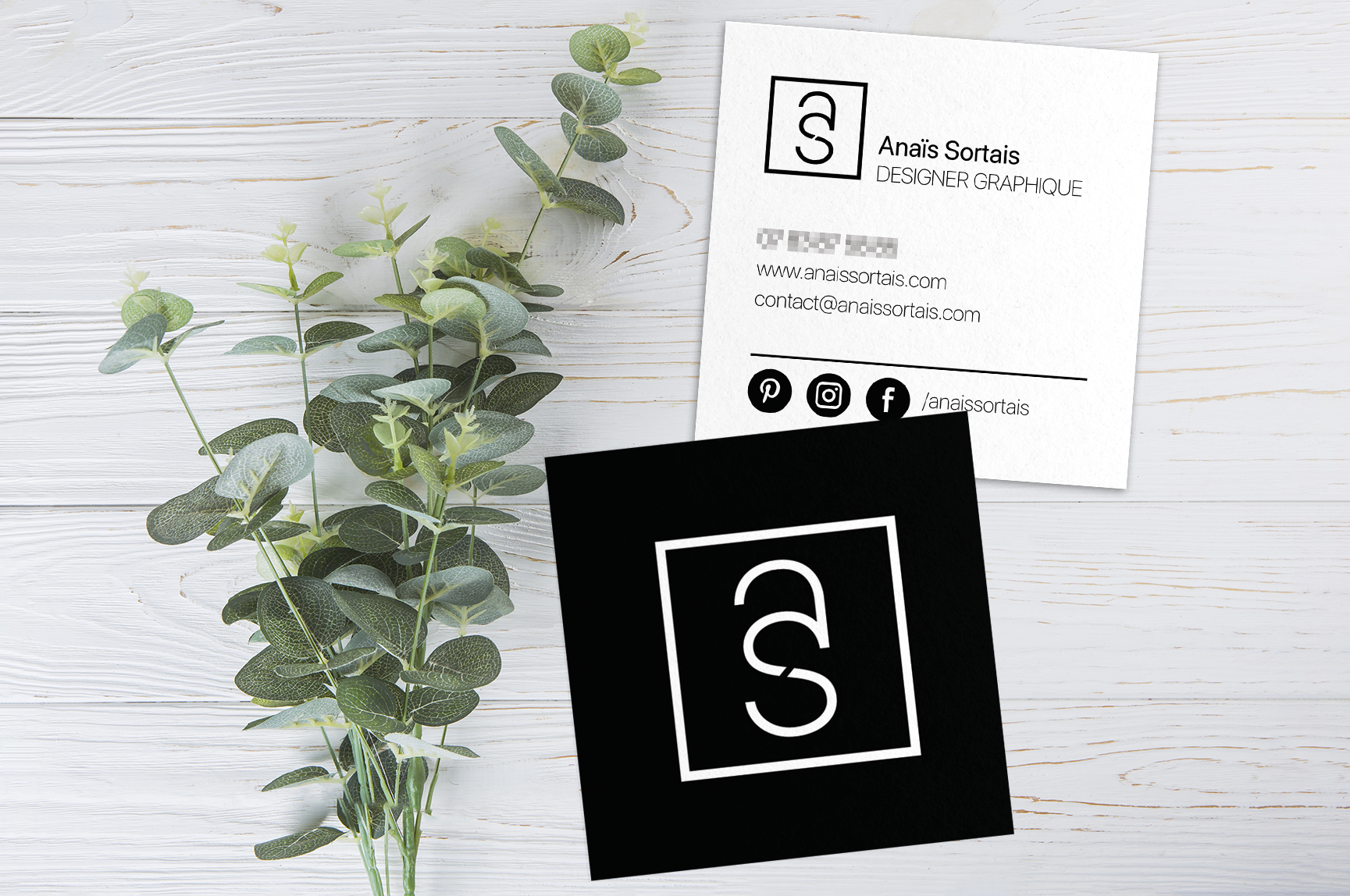
Before : 1 monochromic business card with no distinction between her design job and her online shop

after : 1 business card with 2 different identities on the front for the design part and the back for the shop
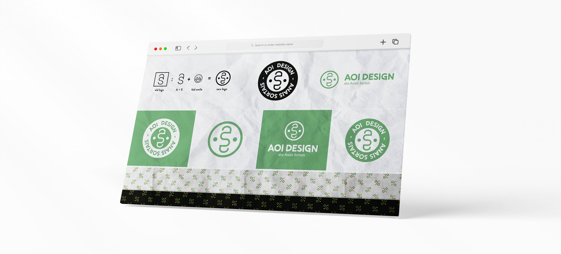
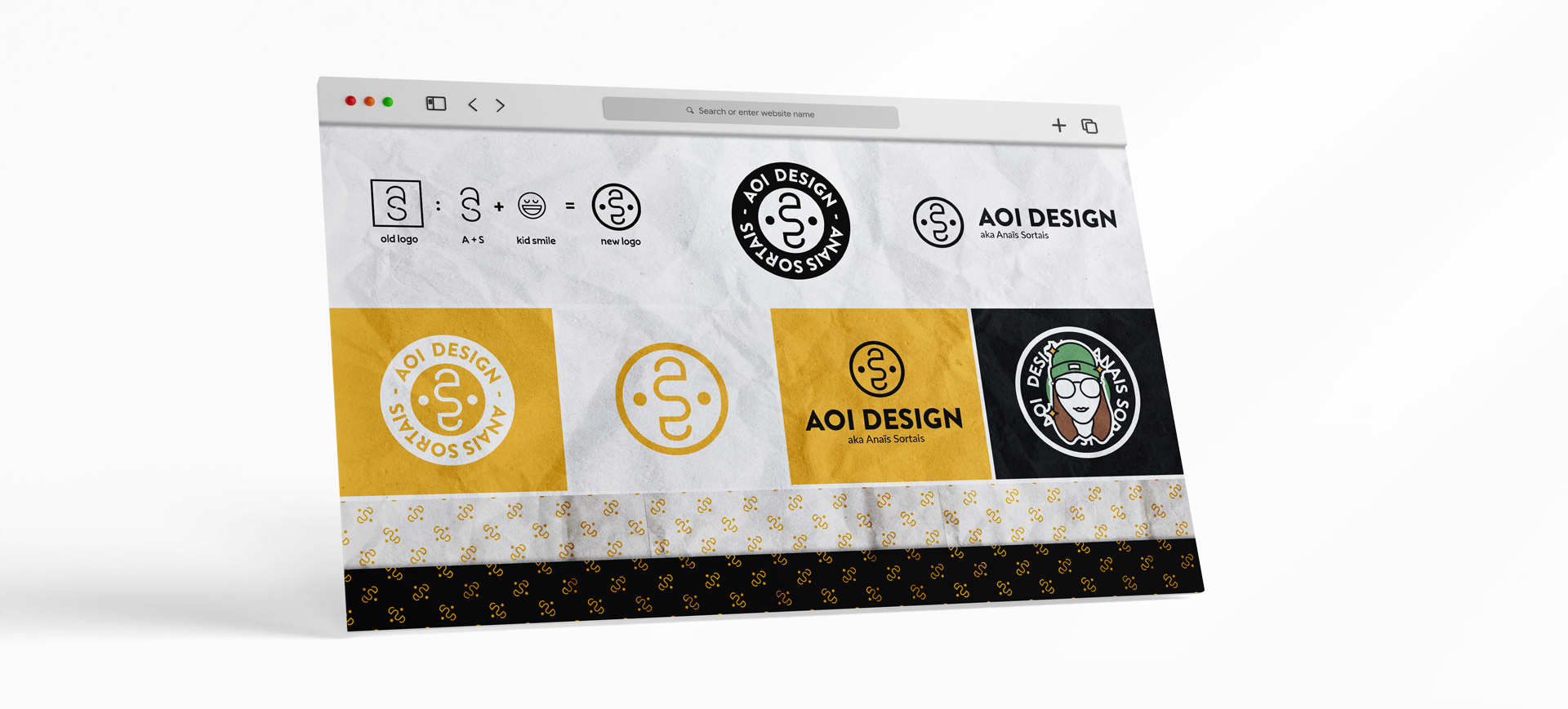
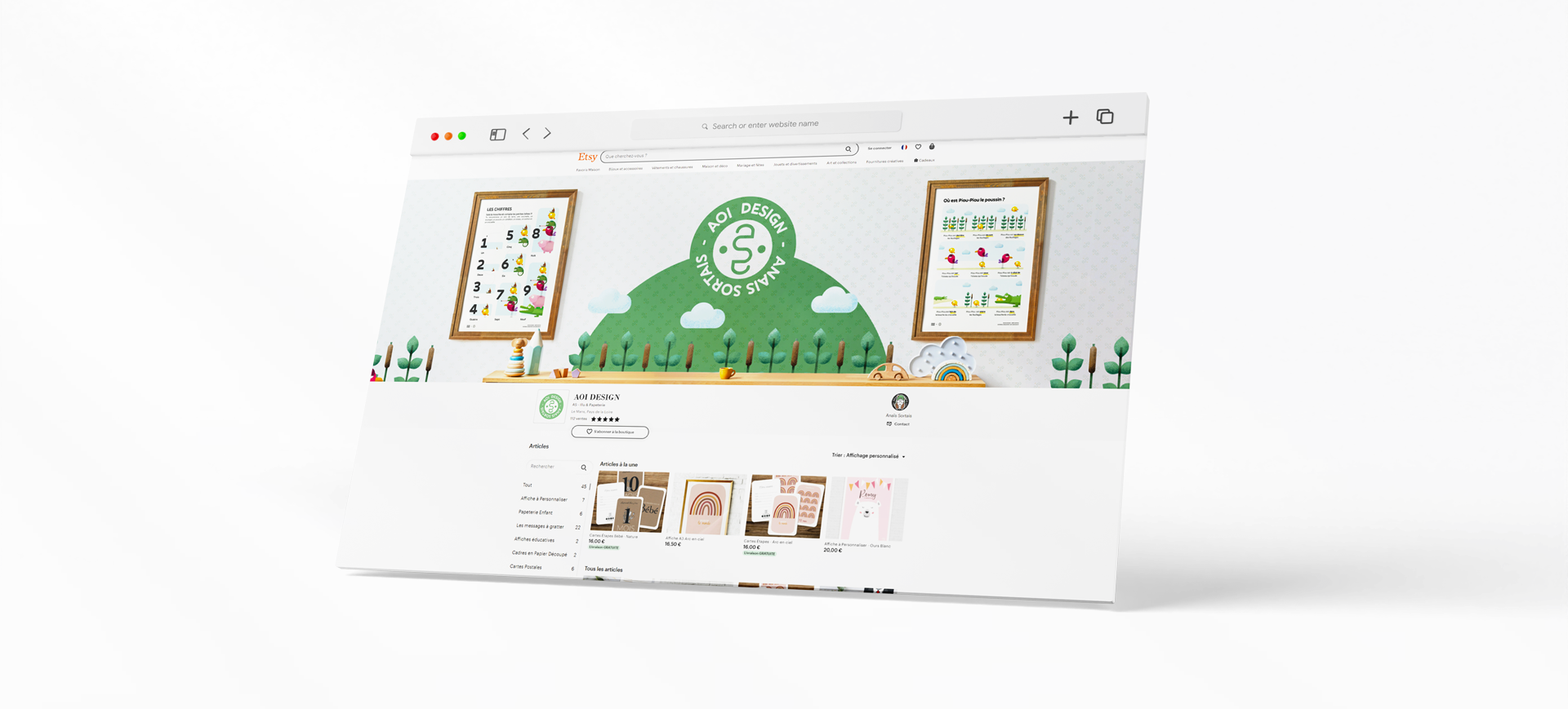
A.S Illustration ask me to rebrand and redesign her two side business : Design Job / Design Shop (mostly for kids). She wanted to keep the idea of her previous logo (A + S) but to change her brand name and to rethink the duality of her identity with something complementary. The AOI is like an accronym based on the vowels in her name and last name. The main logo is a redesign of the old one with the add of the smiley face in it A minimalistic portrait is added so she can switch whenever she want between the main logo and this version. The 2 faces of her identity have a different font and color each so her two activities can clearly be identified.
after : 1 business card with 2 different identities on the front for the design part and the back for the shop